Updates (April 2026 to June 2026)
April 2026 — Updated the page to move information about the AI Security dashboard to a separate category. For more information, see AI Security Dashboard.
Boards (Dashboards) in Traceable are visualization tools that provide insights into the APIs, their security posture, and AI assets in your application ecosystem. Traceable consolidates this complex data and presents it as widgets containing graphs, charts, and tables. Dashboards act as a central hub for analyzing key metrics, such as issue trends, API types, AI models, MCP servers, threat types, and threat activities.
What will you learn in this topic?
By the end of this topic, you will be able to understand:
The concept of boards and how they help.
The types of boards available in Traceable.
The supported widgets in a board.
The way to customize data visibility in a board.
The Home and AI Security dashboards, their widgets, and the actions you can perform on them.
The Custom dashboard, including its available actions, reporting setup steps, and the information it displays.
How boards help
Boards simplify analytics monitoring in your API ecosystem by presenting critical information in an organized, visual format. They enable you to monitor API behaviors, analyze trends, and make informed decisions according to your requirements.
Types of boards
Traceable offers the following dashboards:
A pre-configured Home dashboard with widgets displaying analytics from categories, such as Discovery and Protection. You can customize this dashboard and add or edit widgets according to your requirements.
AI Security Dashboard with widgets displaying analytics into AI assets, such as APIs, models, and MCP servers. You can customize this dashboard to add or edit widgets according to your requirements.
Custom Dashboards, allowing you to tailor widget configurations according to your business needs. This ensures flexibility while providing comprehensive reports.
Supported widgets in a board
While the dashboards are shown in View Mode by default, you can add or customize widgets according to your requirements using Edit Mode. Traceable supports the following widgets in a dashboard:
Table
Time Series
Column
Bar
Donut
Univariate
Each widget includes a set of attributes that you can use to view the data according to your requirements. For more information on these attributes and the widgets, see Widgets. Also, in addition to adding widgets, you can perform multiple actions in a dashboard. For more information, see the sections below.
Customize data visibility on a board
By default, the data in the dashboards is shown for the Last 1 day across All Environments. You can modify these settings to display analytics according to your requirements. For example, let us say you wish to view the analytics for the Sandbox environment for the last month. Then, from the top right corner of the Dashboard, you can select Sandbox from the Environments drop-down and Custom from the Duration drop-down. Further, you can specify the date and time range for Traceable to show the analytics. The data in the widgets is updated to display analytics based on your selected settings.
Note
The applicability of date and time range on widgets may vary depending on their type.
Understand the Home dashboard
This is Traceable’s out-of-the-box dashboard, which presents insights for common use cases, ensuring immediate functionality.
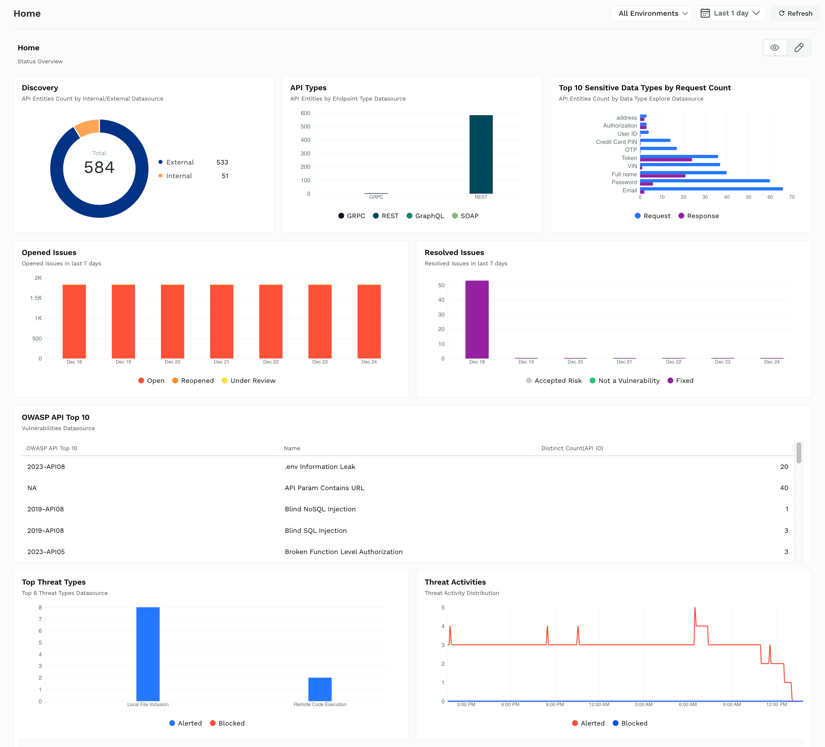
Home Dashboard
Widgets on the Home dashboard
By default, the following widgets are shown on the Home dashboard:
Widget Name | Description |
|---|---|
Discovery | This shows a donut chart with the count of discovered internal and external APIs that have been learned or are under learning. For more information on these APIs, see Discovery. |
API Types | This shows a table with the types of API protocols discovered and their corresponding counts. These counts are derived from the total number of internal and external APIs discovered. For more information on these API types, see Explorer. |
Top 10 Sensitive Data Types by Request Count | This shows a bar chart with the top 10 data types discovered in API requests and responses along with their count. For more information on these data types, see Sensitive Data. |
Opened Issues | This shows a column chart with the security gaps (issues) that are open or under review across discovered API endpoints in the past seven days. When hovering, it also shows the issues’ status and respective counts. For more information on these security gaps, see Issues. |
Resolved Issues | This shows a column chart with the security gaps (issues) that have been closed, resolved, or accepted across discovered API endpoints in the past seven days. When hovering, it also shows the issues’ status and respective counts. For more information on these security gaps, see Issues. |
OWASP API Top 10 | This shows a table with the OWASP API security risk, the vulnerability category to which the security risk belongs, and the count of associated API endpoints. For more information on these risks, see Discovery. |
Top Threat Types | This shows a column chart with the top six threat types identified and the corresponding count of alerted and blocked threats upon hovering. For more information on these threat types, see Threat Activity. |
Threat Activities | This shows a time series chart with the alerted or blocked threats discovered across API endpoints. Upon hovering, it also shows the count of threats discovered at a particular time. For more information on these threats, see Threat Activity. |
Note
The date and time range filters from the above list are applicable only to the Top Threat Types and Threat Activities widgets.
Actions on the Home dashboard
While the above widgets are shown in the Home dashboard by default, you can customize the dashboard to carry out the following actions:
Action | Description |
|---|---|
Add Widgets | Add up to 12 widgets on the dashboard. |
Clone Widgets | Duplicate existing widgets and modify configurations according to your requirements. |
Modify Widgets | Edit the configuration(s) of the existing widgets according to your requirements. |
Remove Widgets | Delete widgets from the dashboard according to your requirements. |
Apart from the above actions, Traceable also allows you to do the following:
Modify the Name and Description of Widgets
Modify the Placement and Size of Widgets
Modify the Dashboard’s Name and Description
Reset the Dashboard to the Default View
For the steps to perform the above actions, see Actions.
As mentioned above, Traceable also allows you to create a custom dashboard and define widgets in it to ensure flexibility. For more information, see the section below.
Understand the Custom dashboard
Custom dashboard provides the flexibility to define unique widgets and configurations tailored to your business requirements. You can create a custom dashboard on this page and define widgets according to your business requirements. To create a new dashboard, complete the following steps:
In the page’s top right corner, click Create New Dashboard.
In the Create New Dashboard pop-up window, specify the dashboard’s Name and Description according to your requirements.
In the top right corner of the dashboard page that appears, click + Add Widget.
Select the widget type and configurations according to your requirements. For more information, see Widgets.
The following demo shows how to perform the above steps.
Actions on the Custom dashboard
Apart from adding widgets, similar to the Home dashboard, you can also carry out the following actions in the dashboard:
Clone Widgets
Modify Widgets
Remove Widgets
Modify the Name and Description of Widgets
Modify the Placement and Size of Widgets
Modify the Dashboard’s Name and Description
Delete the Dashboard
For more information on the steps to do this, see Actions.
Reporting
Apart from the above actions, you can also create a schedule to receive reports for custom dashboards. This automates the delivery of important insights and analytics at regular intervals according to your requirements. This scheduling ensures that you receive updated information in your mailbox without having to manually view the dashboard.
To schedule a report, navigate to Boards → Custom, click the Ellipse (![]() ) icon corresponding to the board you wish to create a schedule for, and complete the following steps:
) icon corresponding to the board you wish to create a schedule for, and complete the following steps:
Click Schedule Report.
In the Schedule Dashboard Report pop-up window, do the following:
Specify a Name for the report, for example, Daily Report for Security Issues Data.
Select the Environment(s) for which you wish to receive the data in the report. Traceable updates the data in the report according to the environment you select.
Select the Frequency and Time (UTC) at which you wish to receive the report. You can also enable or disable the scheduling using the toggle.
Specify the Email(s) where you wish to receive the report.
Click Save.
Traceable sends the report from the no-reply@traceable.ai email address to your configured email address according to the schedule you defined. You can also view the report by clicking the Report (![]() ) icon corresponding to the dashboard for which you created the report. For more information, see Reports.
) icon corresponding to the dashboard for which you created the report. For more information, see Reports.
Custom dashboard view
The Custom Dashboard page lists all dashboards in your account, including the Home Dashboard.
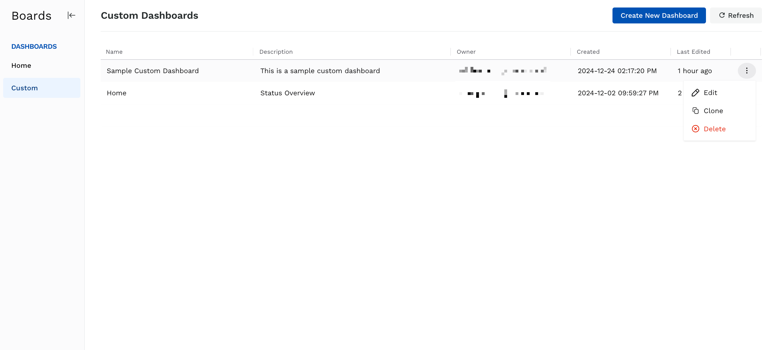
Custom Dashboard
The following information is shown for each dashboard:
Column | Description |
|---|---|
Name | The dashboard name you specified while creating the dashboard. |
Description | The dashboard’s description you specified while creating the dashboard. |
Owner | The team member who created the dashboard. |
Created | The time at which the owner created the dashboard. |
Last Edited | The recency of changes to the dashboard. |
Reports | The indicator to highlight if a report is scheduled for the dashboard. Dashboards with associated reports show the Report ( |
You can view a dashboard by clicking on the corresponding row. Apart from viewing a dashboard, you can click the Ellipse (![]() ) icon corresponding to a row and perform the following actions:
) icon corresponding to a row and perform the following actions:
Edit a dashboard
Clone a dashboard
Delete a dashboard
View Reports associated with the dashboard
Schedule Report for the dashboard