Widgets are the building blocks of Dashboards in Traceable, allowing you to visualize important metrics in a way that best suits your needs. Traceable provides a variety of widgets, such as Table, Bar, Donut, etc., with each designed to represent data for simplifying analysis. By adding or customizing widgets, you can create a personalized dashboard that provides actionable insights at a glance.
Supported Widgets
Traceable offers the following widgets:
Table
Time Series
Column
Bar
Donut
Univariate
Refer to the tabs below for the steps to configure the widgets. Each widget consists of a combination of attributes, which define how and what data should be shown in it.
Attributes in a Widget
Traceable provides the following attributes for a widget:
Attribute | Description |
|---|---|
Datasource | The data origin that Traceable must interact with to display data in the widget. For example, Issues.
|
Selections | The component you wish to add to the widget, such as table columns and donut chart segments. Depending on the widget you select, you can choose multiple components to add to the widget. For example, Issue Names, Categories, and the unique number of APIs corresponding to each Issue Name and Category (Distinct count of API ID). |
Filter | Defines how you wish to filter the data displayed in the widget. You can choose the component you wish to use for filtering data along with the required operator and value from the drop-down list. For example, Issue Severity is equal to ( = ) High. |
Group By | The component you wish to use for grouping similar values, and the maximum number of groups you want to show on the chart. Depending on the widget you select, you can choose multiple components by which the results must be grouped in the widget. For example, a maximum of 7 (Limit) Sensitive Data Types. |
Order By | The component you wish to use for sorting the results, and the order in which you want to sort them, ASC for ascending and DESC for descending. For example, sort by Issue Category in descending order (DESC). |
Limit | This defines the maximum number of elements you want to show in the widget. For example, a limit of 10 for a table widget means that a maximum of 10 rows should be shown in the table at any point in time. |
While configuring a widget, you must specify or select the above attributes and their corresponding fields according to your requirements. However, the availability of certain attributes depends on the widget you choose. For example, the Donut widget does not contain the Order By parameter as it presents data in the form of segments.
Widget Configuration
The following tabs discuss the available widgets and their corresponding configuration steps.
The table widget organizes the data in the form of rows and columns. The cells in these rows and columns are populated with the appropriate values according to the attributes you select while adding them. The following table lists the availability of attributes and datasources for this widget:
Attributes |
For more information on these attributes, see the above section.
|
Datasources |
|
Sample Widget
Following are the steps to add a sample table widget that lists multiple issues, their respective categories, and the corresponding count of unique APIs that have those issues:
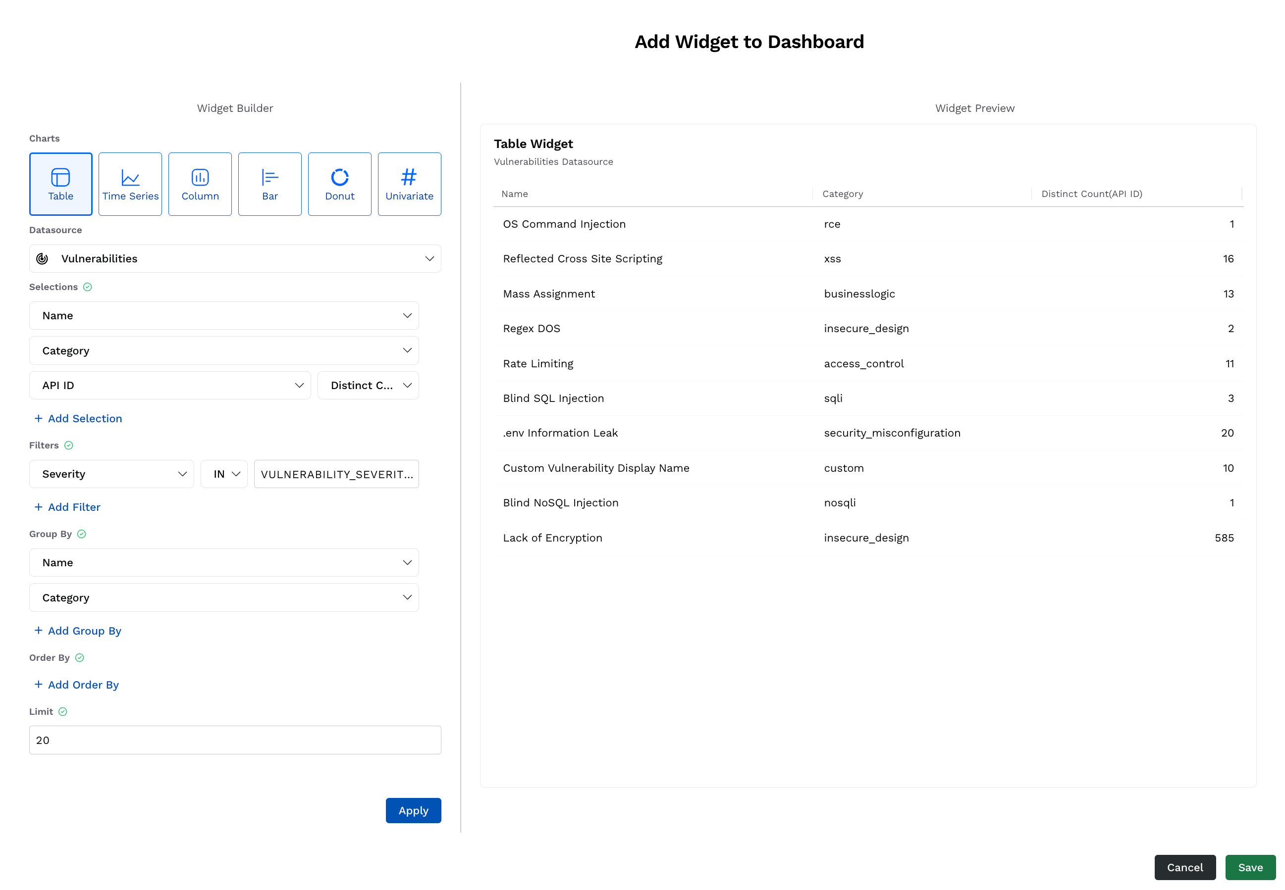
Table Widget
On the Add Widget to Dashboard window, under Widgets, click Table.
From the Datasource drop-down list, select your source of data. For example, Issues.
Under Selections, click + Add Selection and add one or more components to the table. These components form the columns of the table. For example, Issue Name, Issue Category, and unique number of APIs corresponding to each Issue Name and Category (Distinct Count of API ID).
Under Filters, click + Add Filter and add one or more filters by selecting the component, operator, and value from the drop-down list for each. These components filter the data based on the attributes you select. For example, Issue Severity is equal to ( = ) High (ISSUE_SEVERITY_HIGH).
Under Group By, click + Add Group By and add one or more components based on which you want to group values. For example, Issue Name and Category.
Under Order By, click + Add Order By and add the component based on which you wish to sort the values. Traceable, by default, selects ascending order (ASC) for sorting. However, you can change it to descending (DESC) from the drop-down list. For example, sort by Issue Category in descending order (DESC).
Under Limit, specify the maximum number of rows that you want to show in the table. For example, 50.
Click Apply. The widget preview is available in the right pane. You can modify it again according to your requirements using the above settings.
(Optional) Modify the name and description of the widget in the Widget Preview pane according to your requirements.
Click Save. The widget is added to the bottom of the dashboard.
The time series widget organizes the data in the form of a graph. The graph is populated with the appropriate values for the past seven days according to the attributes you select while adding them. The following table lists the availability of attributes and datasources for this widget:
Attributes |
For more information on these attributes, see the above section
|
Datasources |
|
Sample Widget
Following are the steps to add a sample time series widget that lists the count of unique APIs discovered for the default Environment:
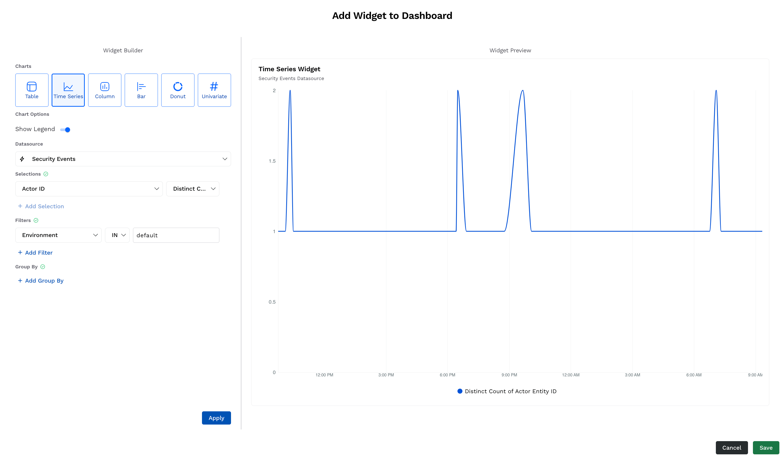
Time Series Widget
On the Add Widget to Dashboard window, under Widgets, click Time Series.
Select the Chart Options according to your requirements.
From the Datasource drop-down list, select your source of data. For example, Security Events.
Under Selections, click + Add Selection and add one or more components to the table. These components form the Y-axis of the widget. For example, a unique number of Threat Actors (Distinct count of Actor ID).
Under Filters, click + Add Filter and add one or more filters by selecting the component, operator, and value from the drop-down list for each. These components filter the data based on the attributes you select. For example, Environment is equal to ( IN ) default.
Click Apply. The widget preview is available in the right pane. You can modify it again according to your requirements using the above settings.
(Optional) Modify the name and description of the widget in the Widget Preview pane according to your requirements.
Click Save. The widget is added to the bottom of the dashboard.
The column widget organizes the data in the form of rectangular columns. The columns populated in the widget represent the appropriate values according to the attributes you select while adding them. The following table lists the availability of attributes and datasources for this widget:
Attributes |
For more information on these attributes, see the above section.
|
Datasources |
|
Sample Widget
Following are the steps to add a sample column widget that lists the top data types discovered and their counts across authenticated APIs:
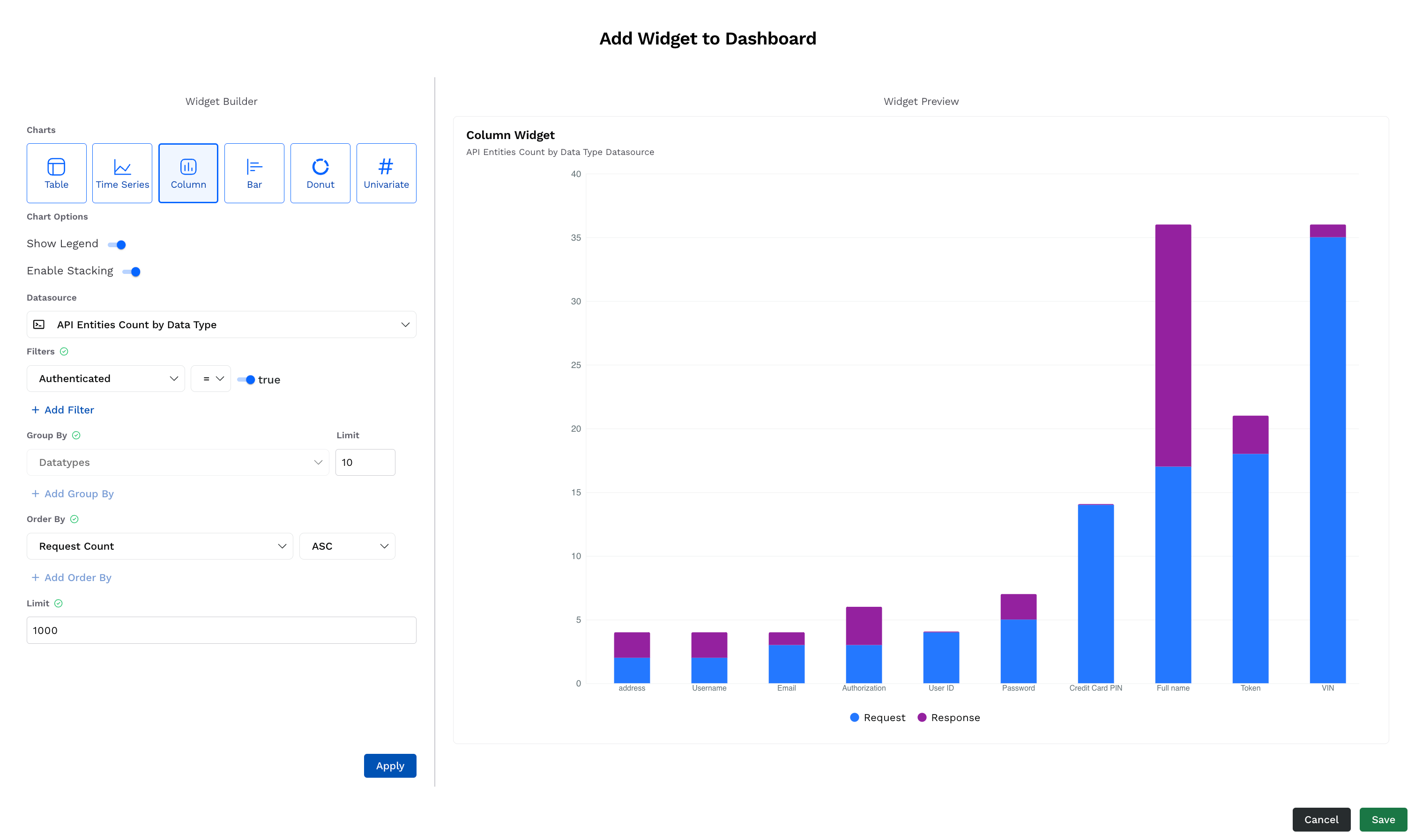
Column Widget
On the Add Widget to Dashboard window, under Widgets, click Column.
Select the Chart Options according to your requirements.
From the Datasource drop-down list, select your source of data. For example, API Entities Count by Data Type.
Under Filters, click + Add Filter and add one or more filters by selecting the component, operator, and value from the drop-down list for each. These components filter the data based on the attributes you select. For example, Authentication is equal to ( = ) true.
Under Group By, specify the Limit according to your requirements. This defines the maximum number of data types that Traceable should display in the widget. Traceable, by default, sets this value to 10. For example, a maximum of 10 (Limit) Sensitive Data Types.
Under Order By, click + Add Order By and add the component based on which you want to sort the values. Traceable, by default, selects descending order (DESC) for sorting, however, you can change it to ascending (ASC) from the drop-down list. For example, sort by Request Count in ascending order (ASC).
Click Apply. The widget preview is available in the right pane. You can modify it again according to your requirements using the above settings.
(Optional) Modify the name and description of the widget in the Widget Preview pane according to your requirements.
Click Save. The widget is added to the bottom of the dashboard.
The bar widget organizes the data in the form of rectangular columns. The graph is populated with the bar height representing the appropriate values according to the attributes you select while adding them. The following table lists the availability of attributes and datasources for this widget:
Attributes |
For more information on these attributes, see the above section
|
Datasources |
|
Sample Widget
Following are the steps to add a sample bar widget that lists the top six threat types across APIs in the production and staging environments:
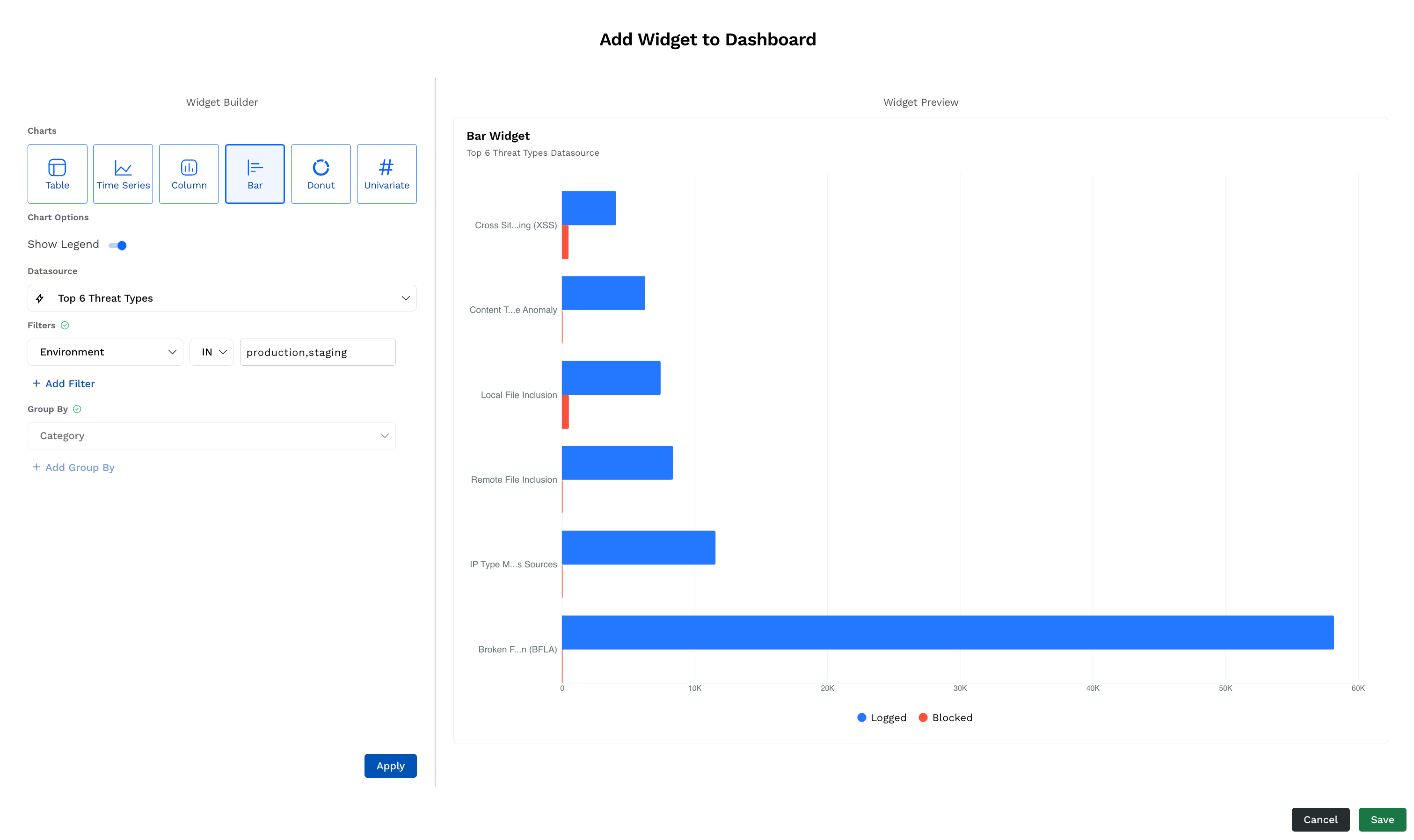
Bar Widget
On the Add Widget to Dashboard window, under Widgets, click Bar.
Select the Chart Options according to your requirements.
From the Datasource drop-down list, select your source of data. For example, Top 6 Threat Types.
Under Filters, click + Add Filter and add one or more filters by selecting the component, operator, and value from the drop-down list for each. These components filter the data according to the attributes you select. For example, Environment is equal to ( = ) production.
Click Apply. The widget preview is available in the right pane. You can modify it again according to your requirements using the above settings.
(Optional) Modify the name and description of the widget in the Widget Preview pane according to your requirements.
Click Save. The widget is added to the bottom of the dashboard.
The donut widget organizes the data in the form of proportional segments. The size of these segments represents the proportional values according to the attributes you select while adding them. The following table lists the availability of attributes and datasources for this widget:
Attributes |
For more information on these attributes, see the above section.
|
Datasources |
|
Sample Widget
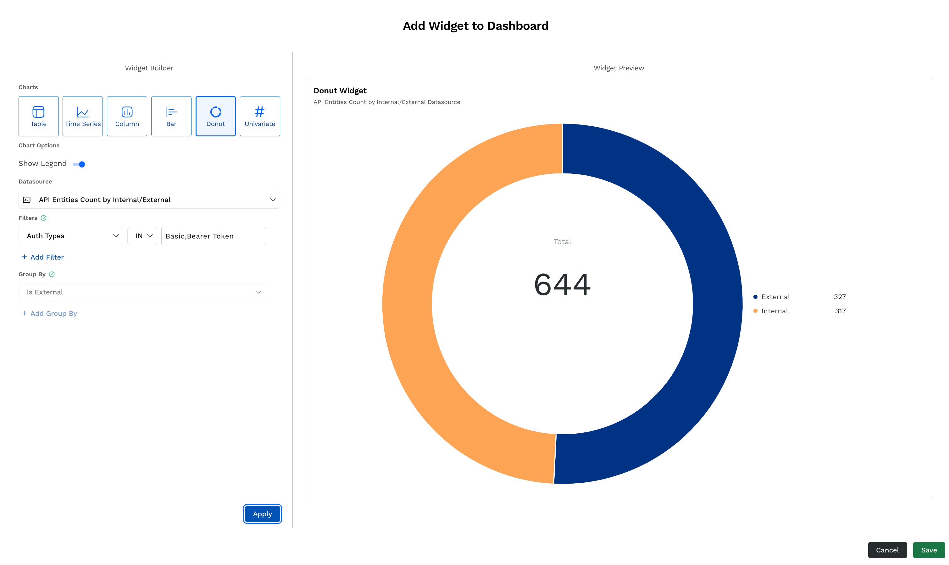
Following are the steps to add a sample donut widget that lists the count of APIs having Auth Type as Basic and Bearer Token, and segregates them based on internal or external:
Donut Widget
On the Add Widget to Dashboard window, under Widgets, click Donut.
Select the Chart Options according to your requirements.
From the Datasource drop-down list, select your source of data. For example, API Entities Count by Internal/External.
Under Filters, click + Add Filter and add one or more filters by selecting the component, operator, and value from the drop-down list for each. These components filter the data based on the attributes you select. For example, Auth Types is equal to ( = ) Basic and Bearer Token.
Click Apply. The widget preview is available in the right pane. You can modify it again according to your requirements using the above settings.
(Optional) Modify the name and description of the widget in the Widget Preview pane according to your requirements.
Click Save. The widget is added to the bottom of the dashboard.
The univariate widget displays data related to a single attribute. The attribute’s value depends on the attributes you select while adding them. The following table lists the availability of attributes and datasources for this widget:
Attributes |
For more information on these attributes, see the above section
|
Datasources |
|
Sample Widget
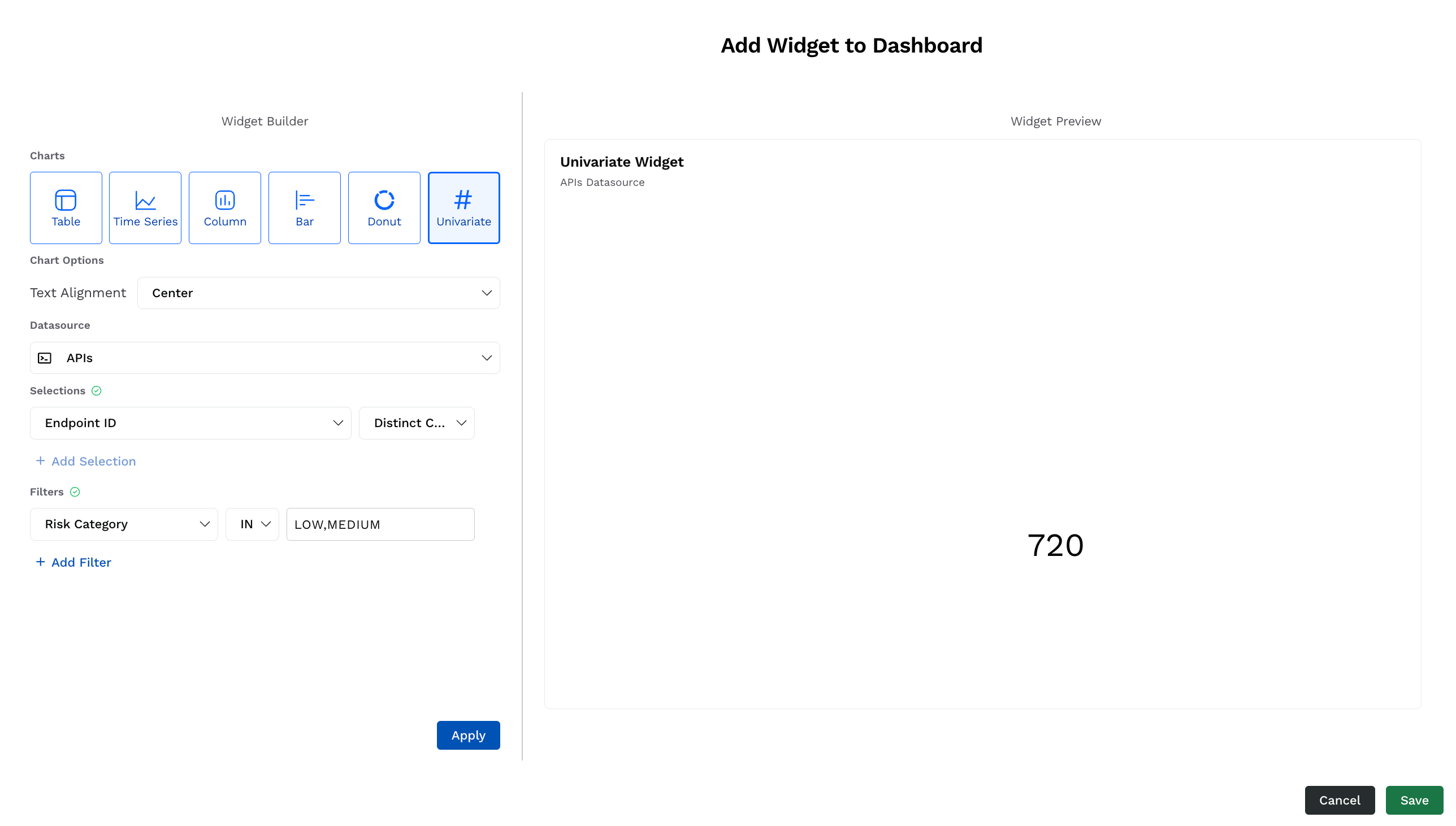
Following are the steps to add a sample univariate widget that lists the count of vulnerable APIs that have High or Critical severity:
Univariate Widget
On the Add Widget to Dashboard window, under Widgets, click Univariate.
Select the Chart Options according to your requirements.
From the Datasource drop-down list, select your source of data. For example, Issues.
Under Selections, click + Add Selection and add the components to the widget. For example, a unique number of APIs (Distinct count of Endpoint ID).
Under Filters, click + Add Filter and add one or more filters by selecting the component, operator, and value from the drop-down list for each. These components filter the data based on the attributes you select. For example, the Risk Category is either ( IN ) Low or Medium.
Click Apply. The widget preview is available in the right pane. You can modify it again according to your requirements using the above settings.
(Optional) Modify the name and description of the widget in the Widget Preview pane according to your requirements.
Click Save. The widget is added to the bottom of the dashboard.