Updates (January 2026 to March 2026)
March 2026 — Updated the page to reflect the new AI Firewall (Beta) dashboard in the Traceable platform. For more information, see Available Dashboards.
The WAAP dashboard in Traceable provides insights into Web Application Protection (WAP), API Protection, AI Firewall (Beta), and Custom Policies data within your Traceable account. These dashboards simplify analytics monitoring by presenting information in an organized, visual format, allowing you to track traffic behavior, threat types, threat sources, and top-attacked destinations.
(2).png)
Protection Dashboards
Available dashboards
Traceable offers the following pre-configured dashboards:
WAF (Web Application Firewall)
API Protection
AI Firewall (Beta)
Custom Policies
These dashboards are populated with widgets displaying analytics aggregated from various components within Protection. For more information, see the tabs under WAAP Dashboards.
Customizing data visibility on the dashboard
By default, Traceable displays the data in the dashboard for the Last 1 day across All Environments. You can modify these values to view the insights for up to 90 days according to your requirements. For example, let us say you wish to view data for the Production environment for the Last 1 week. Then, from the top right corner of the dashboard, you can select Production from the Environments drop-down and Last 1 week from the Duration drop-down.
Traceable updates the data shown in the widgets according to the selected configurations.
Customizing the dashboard
You can also perform multiple actions on the dashboard, such as adding, modifying, and deleting widgets. For more information, see Actions. As part of these actions, Traceable also lets you customize the dashboard and tailor widget configurations to your requirements, ensuring flexibility. For more information, see Customizations.
How are the dashboards useful?
By leveraging the customizable widgets and environment-specific views, you can focus on the dashboard's insights, investigate incidents, and make informed security decisions. You can also use these insights to enable or disable pre-defined policies and create custom policies according to your requirements. For more information, see Policies.
WAAP Dashboards
The following tabs explain the multiple dashboards available in the WAAP dashboard and how they can be useful to you. Click the tab according to your requirements to understand each dashboard.
While these dashboards are pre-configured, you can perform multiple actions and customizations according to your requirements. For more information, see Actions and Customizations.
The WAF, API Protection, and AI Firewall (Beta) dashboards provide insights into the threat data based on the Web Application Firewall Policies, API Protection, and AI Firewall policies you enabled under the Protection → Settings → Policies → WAF, API Protection, or AI Firewall tabs. You can use these dashboards to monitor, analyze, and act on potential threats targeting your APIs and Web Applications.
The widgets in these dashboards are designed based on the common use cases, ensuring immediate usability. While the dashboard shows metrics in these widgets, you can hover over the shown values and click the Drilldown (![]() ) icon to view detailed information about the metric.
) icon to view detailed information about the metric.
By default, Traceable divides the widgets into the following categories:
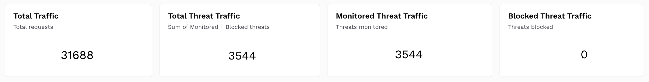
Summary Metrics
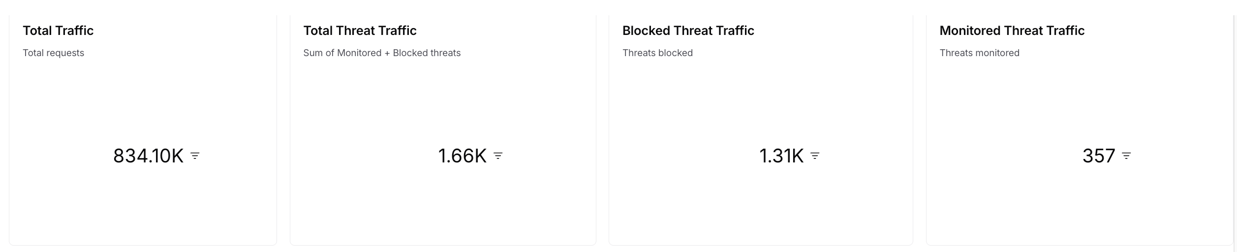
Displays Univariate charts for the following:Total Traffic — The total count of traffic processed. Traceable calculates this value using the unique span IDs. For more information on these spans, see Explorer.
Total Threat Traffic — The count of traffic being considered malicious or a threat. Traffic is considered malicious if assigned the Blocked or Monitored status.
Monitored Threat Traffic — The count of threat traffic out of the total traffic that is being logged (monitored), and not blocked. Traceable considers traffic monitored if it is assigned the Monitored status.
Blocked Threat Traffic — The count of threats being actively blocked. Traffic is considered blocked if it is assigned the Blocked status.
How is it useful?These metrics provide insights into traffic volume and threats, allowing you to assess the amount of malicious activity being monitored or blocked.
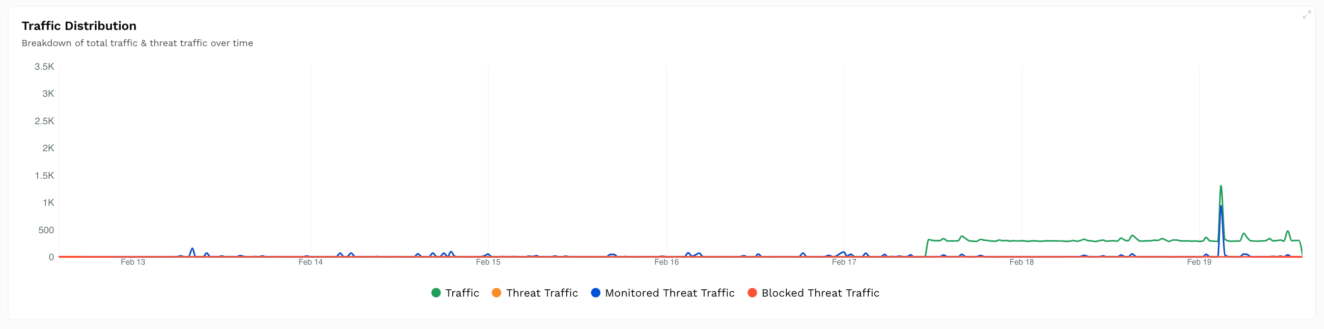
Traffic Distribution
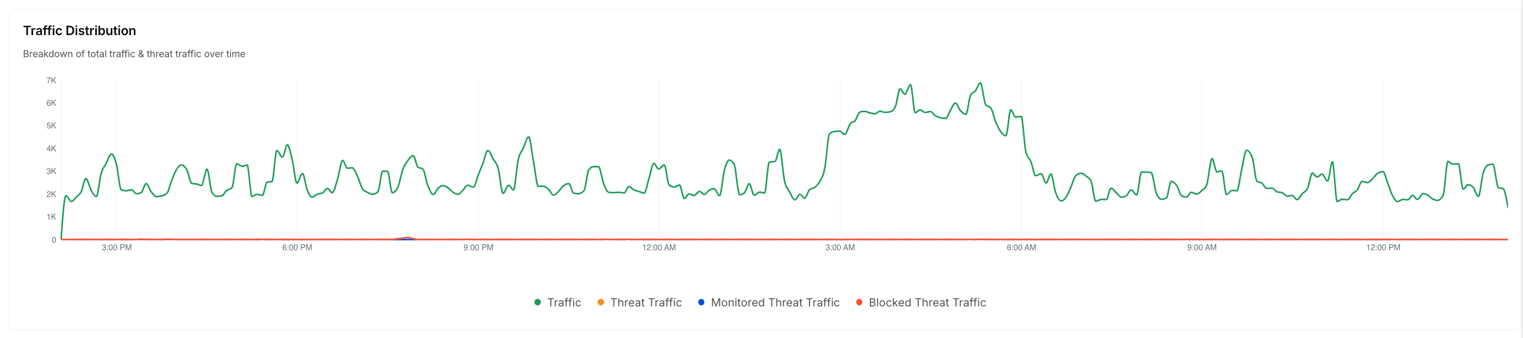
Drills down on the traffic distribution and displays a Time-Series chart that compares the total traffic and the threat traffic. The following types of traffic are displayed in the widget:Traffic — The total traffic received.
Threat traffic — The traffic is considered malicious.
Monitored Threat Traffic — The traffic is being logged (monitored) but not blocked.
Blocked Threat Traffic — The traffic being blocked.
Hovering over it also displayed the count of the above traffic at a particular time.
How is it useful?This chart provides insights into traffic spikes, which you can correlate with attack attempts and determine the time of most malicious activity.
Threat Classification and Events by Vulnerability Taxonomies
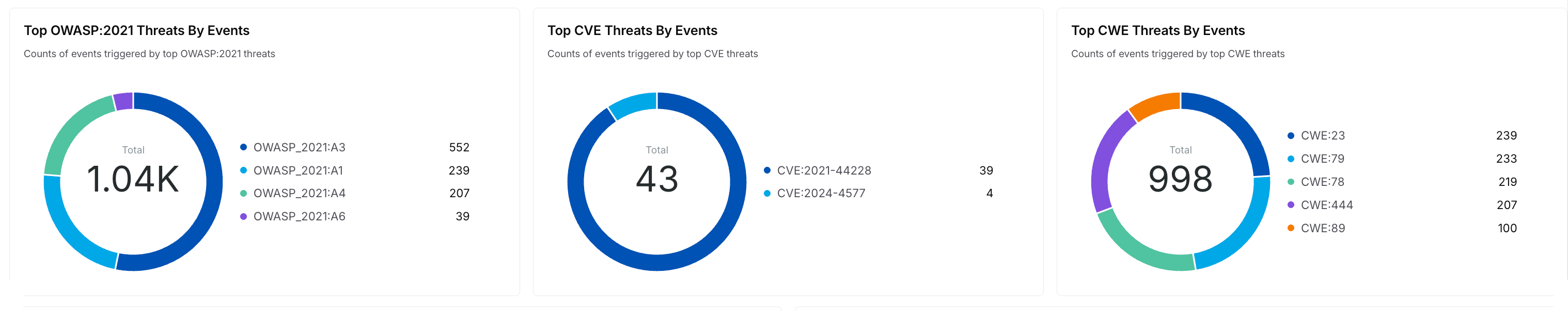
Drills down on the threat classifications and shows Donut charts with the threat counts categorized by:OWASP 2021 — The OWASP API Security Top 10 threats.
CVE — The known CVE classifications.
CWE — The threats mapped to CWE classifications.
How is it useful?
These charts provide insights into the common industry threats detected by the policies, allowing you to prioritize mitigations according to your requirements.Top Threat Types Distribution
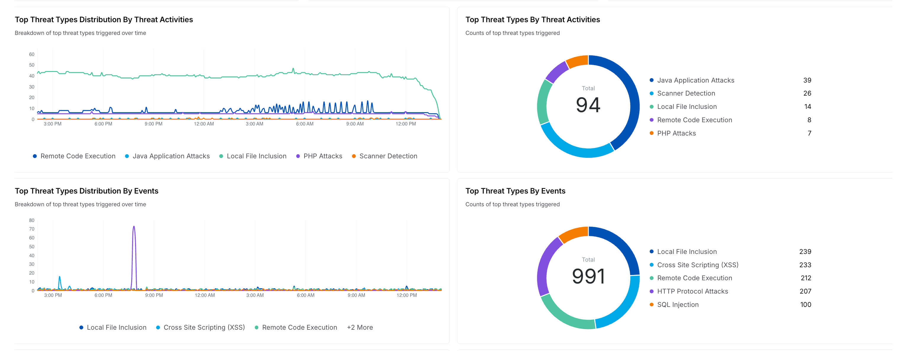
Drills down on the threat types and displays Time Series and Donut charts with the count of threats, grouped by Threat Activities and Events. For example, the above image displays charts for threat types like Java Application Attacks, Local File Inclusion, etc.
How is it useful?
These charts provide insights into the top five attacks affecting your traffic and help security teams prioritize their resolutions accordingly.Top Threat Rules Distribution
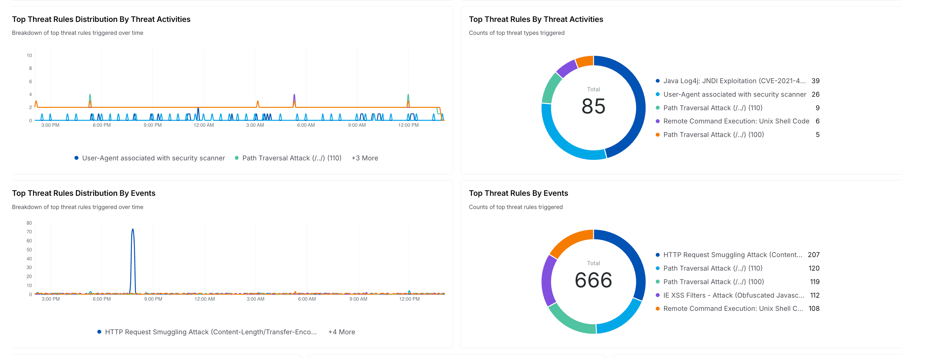
Drills down on the threat rules and displays a Time Series and Donut chart with the count of threat rules triggered over time, grouped by Threat Activities and Events. For example, the above image displays charts for threat rules like Restricted File Access Attempt, Path Traversal Attack, etc.
How is it useful?
These charts provide insights into the security rules most often triggered, so you can fine-tune them to your requirements. For more information, see Policies.Top Threat Sources Distribution
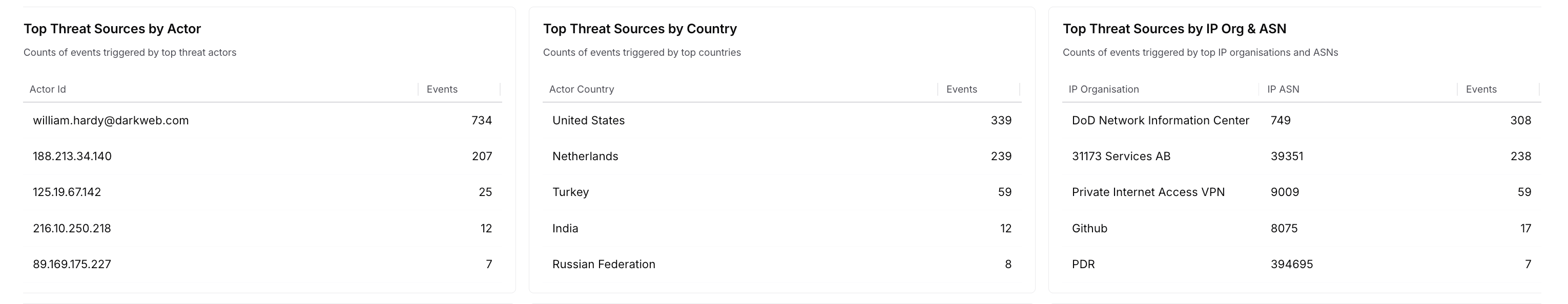
Drills down on the threat sources distribution and displays Table charts with event counts categorized by:Actor ID — The user identifier of attackers.
IP Organization and ASN — Identifies attacks by the ISP or organization.
Country — The countries from which the attacks originate.
How is it useful?These charts provide insights into the regions of attack origination, actors repeatedly posing a threat, and high-risk countries. Based on these insights, you can fine-tune Policies to block attacks.
Top Attacked Destinations
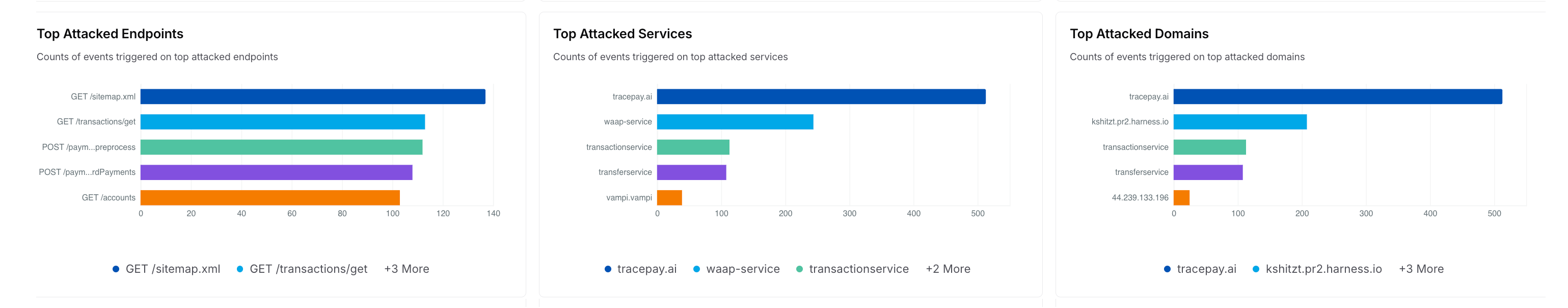
Drills down on the top attacked destinations and displays Table charts with event counts categorized by:Endpoints — The API endpoints being attacked.
Services — The Services being attacked.
Domains — The Domains being attacked.
How is it useful?
These charts provide insights into vulnerable APIs, services, and domains, allowing you to fine-tune Policies for protection.
The Custom Policies dashboard provides insights into the threat data based on the Custom policies you have created under the Protection → Settings → Policies → Custom Policies tab. You can use this dashboard to monitor and analyze threats and fine-tune the custom policies according to your requirements.
The widgets in these dashboards are designed based on the custom policy types, ensuring immediate usability. While the dashboard shows metrics in these widgets, you can hover over the shown values and click the Drilldown (![]() ) icon to view detailed information about the metric.
) icon to view detailed information about the metric.
By default, Traceable divides the widgets into the following categories:
Summary Metrics
Shows Univariate charts for the following:Total Traffic — The count of total traffic processed. Traceable calculates this value using the unique span IDs. For more information on these spans, see Explorer.
Total Threat Traffic — The count of traffic being considered malicious/threat. Traceable considers traffic malicious if assigned the Blocked or Monitored status.
Monitored Threat Traffic — The count of threat traffic out of the total traffic that is being logged (monitored), and not blocked. Traceable considers traffic monitored if it is assigned the Monitored status.
Blocked Threat Traffic — The count of threats being actively blocked. Traceable considers traffic blocked if it is assigned the Blocked status.
How is it useful?
These metrics provide insights into traffic volume and threats, allowing you to assess the amount of malicious activity being monitored or blocked.
Traffic Distribution
Drills down on the above Summary Metrics and shows a Time-Series chart that compares the total traffic and the threat traffic. The following types of traffic is shown in the widget:Traffic — The total traffic received.
Threat traffic — The traffic considered malicious.
Monitored Threat Traffic — The traffic being monitored/analyzed.
Blocked Threat Traffic — The traffic being blocked.
Upon hovering, it also shows the count of the above traffic at a particular time.
How is it useful?This chart provides insights into traffic spikes, which you can correlate with attack attempts, and determine the time having the most malicious activity.
Top Malicious Sources Distribution
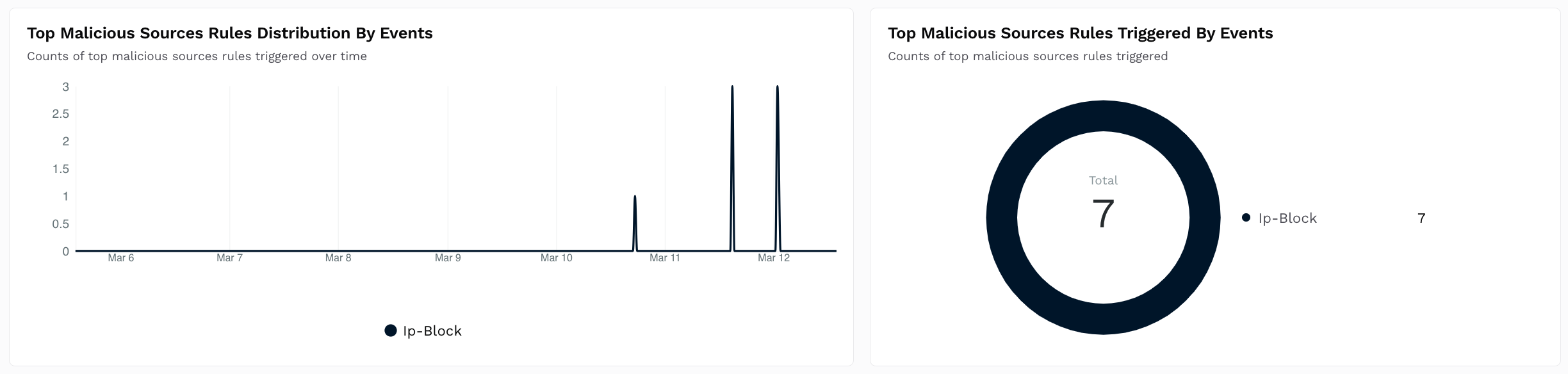
Shows a Time Series and Donut chart with the count of malicious source rules triggered over time.
How is it useful?
These charts provide insights into the policies that are most often triggered so that you can fine-tune them according to your requirements. For more information, see Policies.Top Custom Signature Distribution
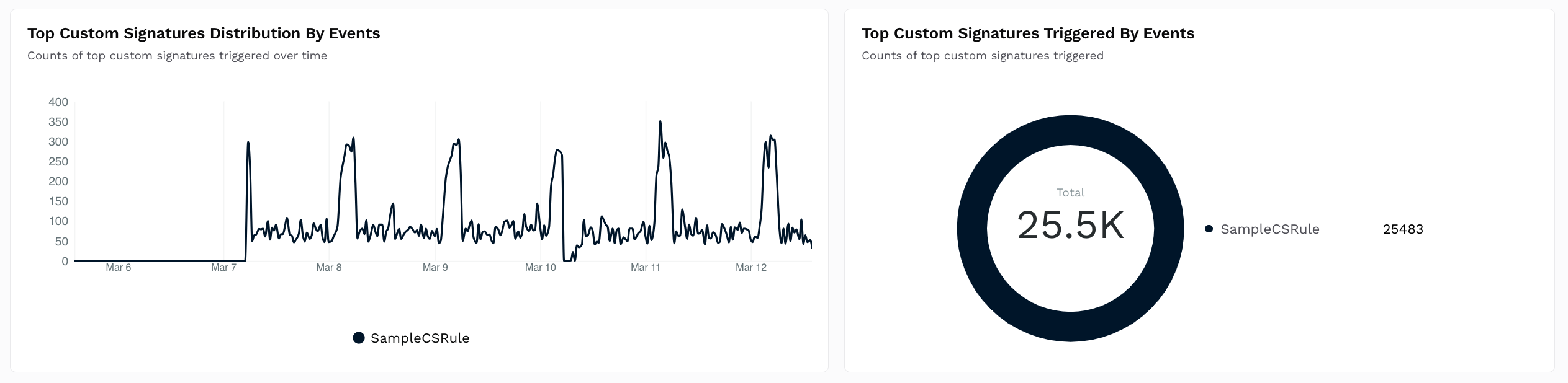
Shows a Time Series and Donut chart with the count of custom signature rules triggered over time.
How is it useful?
These charts provide insights into the policies that are most often triggered so that you can fine-tune them according to your requirements. For more information, see Policies.Top Rate Limiting Distribution
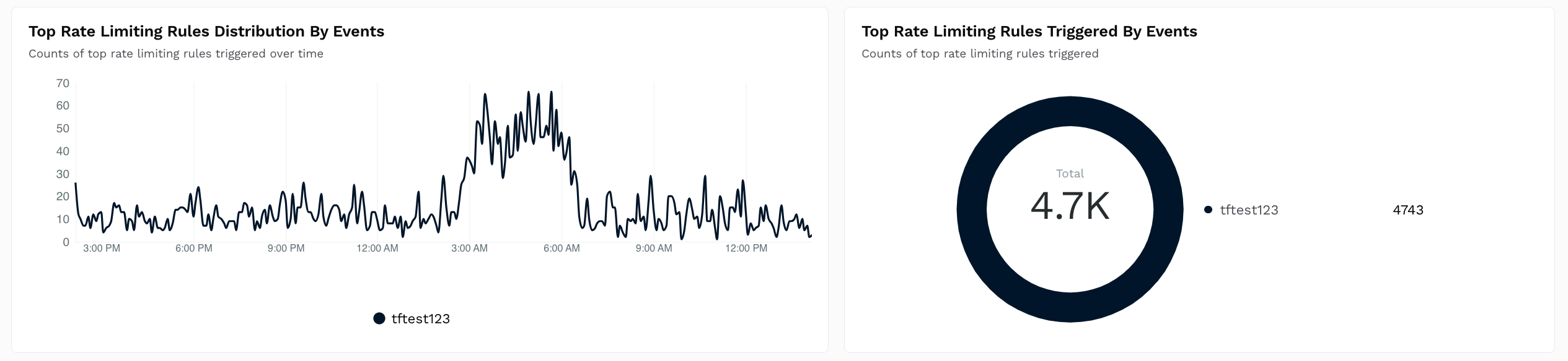
Shows a Time Series and Donut chart with the count of rate-limiting rules triggered over time.
How is it useful?
These charts provide insights into the policies that are most often triggered so that you can fine-tune them according to your requirements. For more information, see Policies.Top Data Loss Prevention Distribution
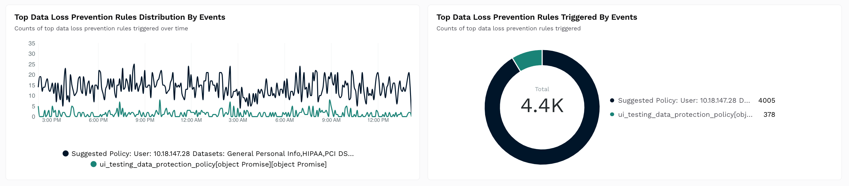
Shows a Time Series and Donut chart with the count of data loss prevention (DLP) rules triggered over time.
How is it useful?
These charts provide insights into the policies that are most often triggered so that you can fine-tune them according to your requirements. For more information, see Policies.Top Enumeration Distribution
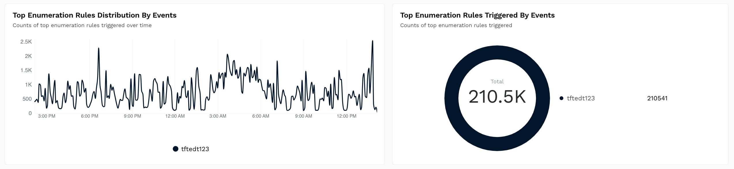
Shows a Time Series and Donut chart with the count of enumeration rules triggered over time.
How is it useful?
These charts provide insights into the policies that are most often triggered so that you can fine-tune them according to your requirements. For more information, see Policies.Top Threat Sources Distribution
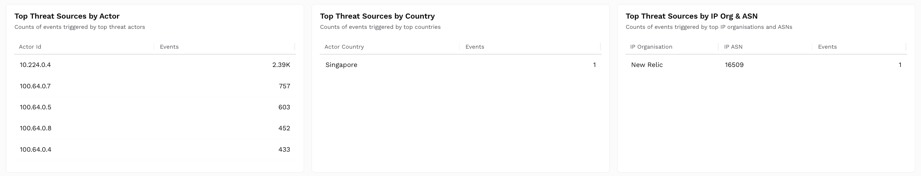
Shows Table charts with event counts categorized by:Actor ID — The user identifier of attackers.
IP Organization and ASN — Identifies attacks by the IP Org and ASN.
Country — The countries from which the attacks originate.
How is it useful?These charts provide insights into the regions of attack origination, actors posing a threat repeatedly, and high-risk countries. Based on these insights, you can create Custom Policies to block attacks.
Top Attacked Destinations
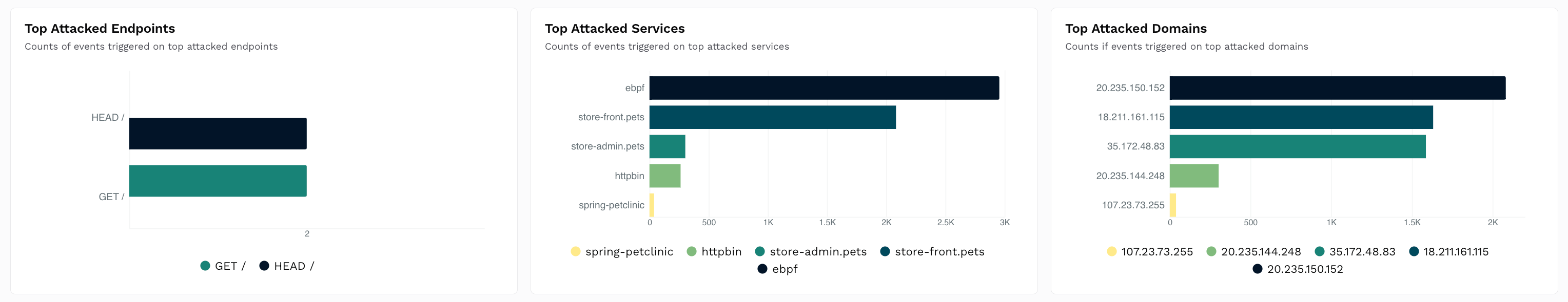
Shows Table charts with event counts categorized by:Endpoints — The API endpoints being attacked.
Services — The Services being attacked.
Domains — The Domains being attacked.
How is it useful?
These charts provide insights into vulnerable APIs, services, and domains, enabling you to set up Custom Policies for protection.