The WAAP dashboards are shown in View Mode (![]() ) by default; however, you can add or customize widgets according to your requirements using Edit Mode (
) by default; however, you can add or customize widgets according to your requirements using Edit Mode (.png) ).
).
Widgets and their use in Dashboards
Widgets are the building blocks of the WAAP Dashboards in Traceable, allowing you to visualize important metrics in a way that best suits your needs. These widgets are made using charts and multiple other attributes. Traceable provides a variety of charts, such as Table, Bar, Donut, etc., to customize a widget, with each chart designed to represent data for simplifying analysis. By adding or customizing widgets, you can create a personalized dashboard that provides actionable insights at a glance.
Supported Chart Types and Widget Anatomy
Traceable supports the following charts in dashboard widgets:
Table
Time Series
Column
Bar
Donut
Univariate
Each widget, along with the above supported charts, consists of a set of attributes that define how and what data should be shown in it. You can use these attributes and customize the dashboard according to your requirements. For more information, see the sections below. Apart from adding widgets, you can also carry out multiple actions in a dashboard. For more information, see Actions.
Widget Builder Attributes
Traceable provides the following attributes for a widget:
Attribute | Description |
|---|---|
Charts | The different types of charts you wish to choose from to best visualize the data. For example, Donut. |
Chart Options | The options to control what to show and how you wish to format the data. For example, Show Legend.
|
Datasource | The data origin that Traceable must interact with to display data in the widget. For example, the threat-related security data (Security Events).
|
Selections | The metric you wish to measure using the widget. This includes the primary data field you wish to analyze, along with how Traceable should process the data. For example, how many times a different security event occurred (Count of Event ID). Depending on the chart you select, you can choose multiple components to add to the widget. |
Filter | The option to fine-tune and show only the relevant data in the chart, making it more actionable. This includes the component you wish to use for filtering data along with the required operator and value from the drop-down list. For example, show only security events from the MODSEC family (Event Family IN MODSEC). |
Group By | The component you wish to use for grouping similar values, and the maximum number of groups you want to show on the chart. Depending on the widget you select, you can choose multiple components by which the results must be grouped in the chart. For example, group events by CVE as the Threat Label, with a maximum of 5 categories. |
Order By | The component you wish to use for sorting the results, and its order in the chart, ASC for ascending and DESC for descending. For example, sort by Event ID Count in descending order (DESC). |
Limit | This defines the maximum number of elements you want to show in the chart. For example, a limit of 10 for a table widget means that a maximum of 10 rows should be shown in the table at any point in time. |
While configuring a widget, you must specify or select the above attributes and their corresponding fields according to your requirements.
Note
The availability of certain attributes depends on the chart you select.
Widget Configurations
The following tabs discuss the charts for configuring widgets, the attributes available in each widget, and a sample widget for reference.
The table widget organizes the data in the form of rows and columns. The cells in these rows and columns are populated with the appropriate values according to the attributes you select while adding them. The following table lists the availability of attributes and datasources for this widget:
Attributes |
For more information on these attributes, see the above section.
|
Datasources |
|
The time series widget organizes the data in the form of a graph. The graph is populated with the appropriate values for the past seven days according to the attributes you select while adding them. The following table lists the availability of attributes and datasources for this widget:
Attributes |
For more information on these attributes, see the above section
|
Datasources |
|
The column widget organizes the data in the form of rectangular columns. The columns populated in the widget represent the appropriate values according to the attributes you select while adding them. The following table lists the availability of attributes and datasources for this widget:
Attributes |
For more information on these attributes, see the above section.
|
Datasources |
|
The bar widget organizes the data in the form of rectangular columns. The graph is populated with the bar height representing the appropriate values according to the attributes you select while adding them. The following table lists the availability of attributes and datasources for this widget:
Attributes |
For more information on these attributes, see the above section
|
Datasources |
|
The donut widget organizes the data in the form of proportional segments. The size of these segments represents the proportional values according to the attributes you select while adding them. The following table lists the availability of attributes and datasources for this widget:
Attributes |
For more information on these attributes, see the above section.
|
Datasources |
|
The univariate widget displays data related to a single attribute. The attribute’s value depends on the attributes you select while adding them. The following table lists the availability of attributes and datasources for this widget:
Attributes |
For more information on these attributes, see the above section
|
Datasources |
|
Sample Widget
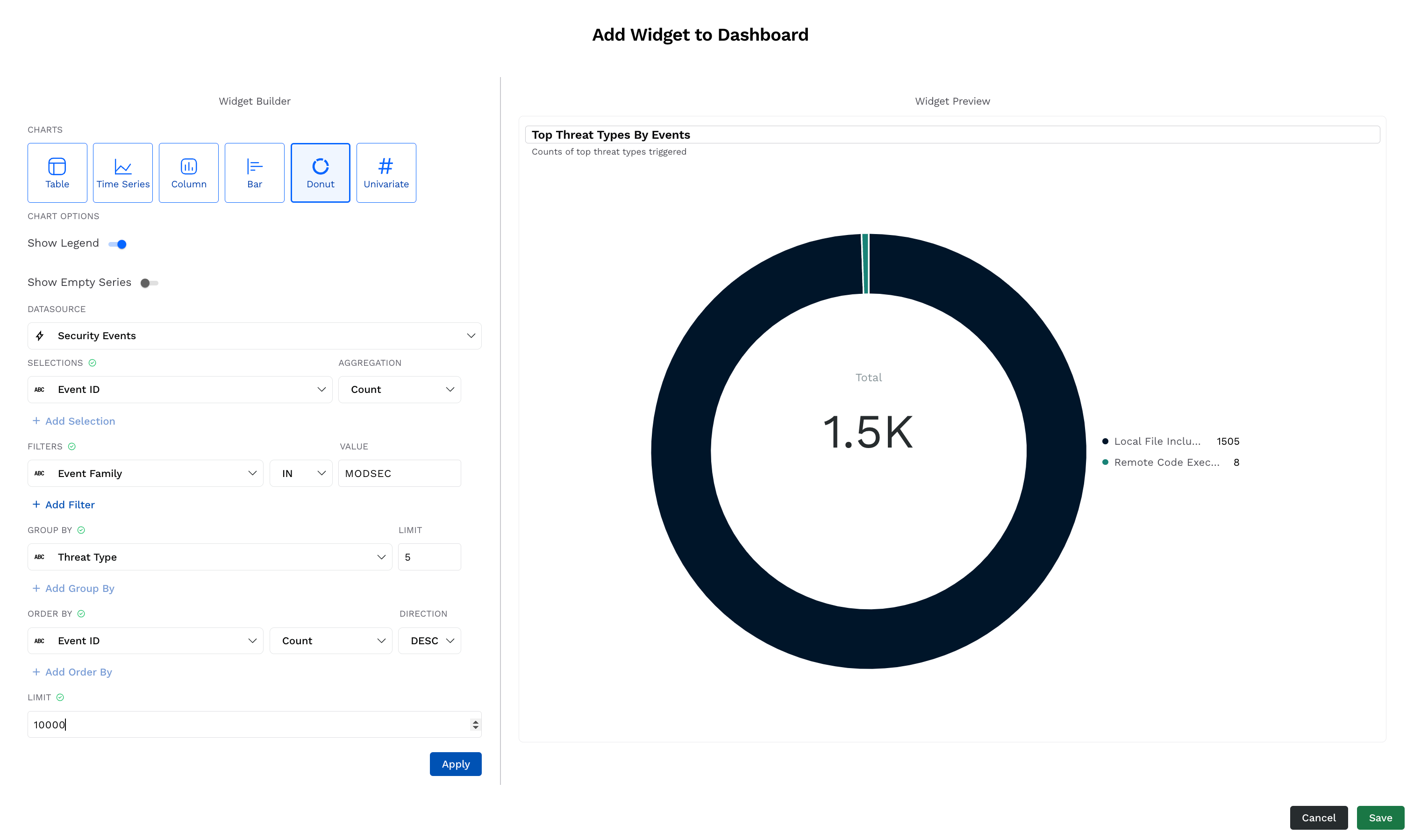
The following are the steps to add a sample donut widget that lists the top 5 threat types that Traceable has encountered from the MODSEC family, sorted in descending order:
Sample Widget
In the Widget Builder window, under Charts, click Donut.
Select the Chart Options according to your requirements.
From the Datasource drop-down list, select your source of data. For example, Security Events.
From the Selections drop-down list, select the metric and the corresponding aggregation. For example, the Count (Aggregation) of Event ID (Selection).
Under Filters, click + Add Filter and add one or more filters by selecting the component, operator, and value from the drop-down list for each. These components filter the data based on the attributes you select. For example, Event Family is ( IN ) MODSEC.
Under Group By, select the component to group the data by, and the maximum number of groups to display in the widget. For example, a maximum of 5 (Limit) Threat Types (Group By Component).
Under Order By, select the component you wish to use for sorting the results. For example, in DESC order using Count of Event ID.
Specify the Limit.
Click Apply. The widget preview is available in the right pane. You can modify it again according to your requirements using the above settings.
(Optional) Modify the name and description of the widget in the Widget Preview pane according to your requirements.
Click Save. The widget is added to the bottom of the dashboard.